The future of Womanizer is here: Renowned pleasure product brand shares new logos and branding
As Womanizer reaches its 7 years anniversary, the brand has revealed a new logo, signifying its entry into a new era. The new logo and brand elements provide a bold, modernized take on the original Womanizer image and represent the brand’s values: sophisticated, bold, empowering, and inclusive.
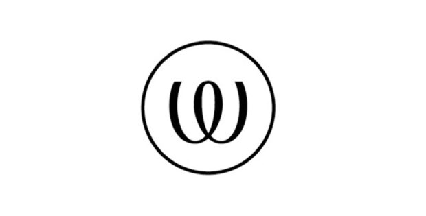
Along with the new look and feel, the new Womanizer logo is optimized for mobile and online usage and is easy to read in smaller versions. The new logo aims to be recognizable for customers, without losing its original values and also keeping the familiarity of the original trademark. The previous design consisted of fine lines and cursive font, but now features bolder semi-serif typography making it feel more powerful, modern, and updated, further aligning with the brand’s values. Its main character is the ‘W’, which is also used as the brand’s calling card. It aims to achieve recognition as an elegant symbol, synonymous with an equally elegant brand, and is enclosed by a circle to portray a movement loop that symbolizes the brand’s Pleasure Air Technology.
The re-brand made its debut on the packaging of three new and improved versions of Womanizer’s iconic products: Premium 2, Classic 2 and Starlet 3.