Dorcel establishes itself as the ‘house of pleasure’ with a whole new identity
On December 1, 2021, Dorcel unveiled its new identity: modern, refined, elegant and sensual. The new logo of the benchmark brand for chic pleasure since 1979 celebrates its evolution, in tune with its time and premium standing.
Since its creation four decades ago, Dorcel has always known how to evolve with society to remain a major player of pleasure and fantasy. After more than 40 years of making millions of adults fantasize, the French brand, present in more than 75 countries, is more than ever the home of pleasure for all. Dorcel is increasingly dedicated to helping all adults experience a relaxed, happy, refined and responsible sexuality through its range of pleasure accessories, lingerie, films and fantasies.
Ten years after replacing the famous toucan (the brand’s first logo until 2011) with its pink seal, Dorcel once again called upon the Dragon Rouge agency to support its move upmarket with a rebranding symbolizing this evolution. “With the Dorcel team, we were able to shed light on new uses and new expectations regarding sexual pleasures. More lifestyle, more inclusive and more responsible, the new graphic and verbal identity reflects a sincere shift in an iconic brand for many French people”, explains Mathieu Sakkas, Managing Director of Dragon Rouge.
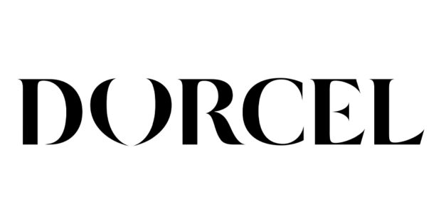
The ‘crest’ (brackets forming the “O”) underlines all the sensuality of the brand in an evocative form. Dorcel asked more than 15,000 people to test this new logo and symbol.
All Dorcel’s websites and social networks will display this new identity from December 1st, and all other media (product packaging, signs, etc.) will be updated during 2022.